When you access a certain webpage, you’re expecting a specific type of look. You want an appealing website that has the qualities of usability and accessibility. The three components are effectiveness, efficiency, and satisfaction. All three combined create a well-laid out webpage that is appropriate for its purpose. The effectiveness of a website is the ability to create a page that achieves it’s objective and the efficiency is how quickly or easily that objective is reached. The satisfaction of the user is whether a consumer was content during this process or not. Accessibility can be seen as successful when a user with disability is able to complete their want with ease.
Initially working on WordPress, I immediately noticed some things that frustrated me. The biggest problem by far, was trying to achieve a certain look with the themes provided. The tool bar, which has the most basic of all formatting, was treacherous to work with. The title, caption, and text were a hassle to adjust especially if I wanted all three to be the same font. Another issue I quickly realized was there was no text to speech option and there was no transcript for the ones who are unable to hear. This makes my webpage limited and only available to a set amount of viewers decreasing my level of accessibility. I would lastly change the navigation of this page. There is a lot of going back and forth to get from one page of my blog to another. I would create an layout so that viewers can get from one page to another easily without having to struggle.This would create a higher level of user satisfaction while increasing the pages effectiveness and efficiency.
Web Pages With Good Usability and Accessibility
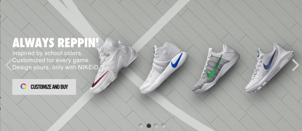
Nike’s webpage is probably one of the best I’ve seen. As you can see in the screenshot, there is the option to customize and buy which makes it satisfactory for the customer. But it is also provides brief text to help the user identify it’s purpose.

This website uses color as it’s ally. It’s highlighted red for explore to engage a consumer to dig deeper into the website, but it also keeps a good headline statement questioning the user, “How far will it take you?” This is a part of the Web Content Accessibility.
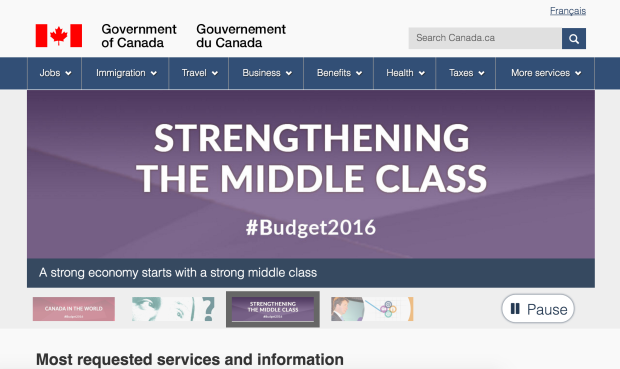
This webpage is the definition of usability due to its easy navigation as well as its accuracy in effective results. This screen shot shows a chunk of relevant information provided on their site.
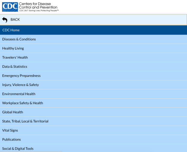
This webpage is interesting because you can switch languages, which increases the websites accessibility immensely. The toolbar at the top also makes navigation easier for users. This follows the idea of consistency and standards.
Web Pages With Poor Usability and Accessibility
This webpage was by far the worst one I’ve seen. The colors are not adjustable and are extremely straining to the eye. It doesn’t allow for background color change, which is a guideline for Web Content Accessibility.
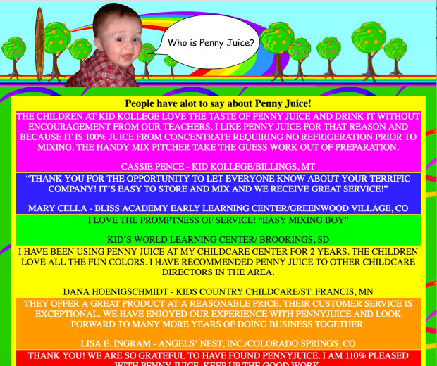
Initially looking at this website, it’s hard to understand it’s purpose. It’s very messy and the goal of the website is unclear. It has no rhythm or rhyme to it’s layout making it unappealing and difficult to navigate.
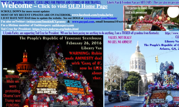
Navigation on this website is very difficult and the website layout isn’t the most appealing. While navigating this page, I realized going back to where I started or a previous page was near impossible.
This webpage gets a zero for user satisfaction. The website itself is not very easy to understand and it’s level of effectiveness is very low.
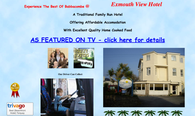
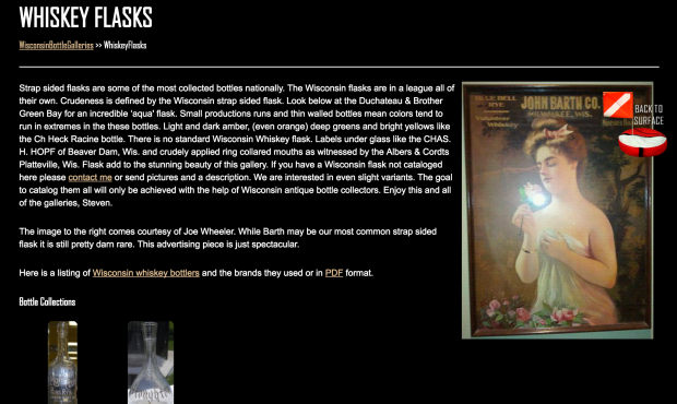
If I had the ability to change the websites I would make sure the usability and the accessibility were both effective. I feel like all the webpages that weren’t good lacked in structure and organization. Navigation was a large issue within these four websites. I’d change up the layout and make it more appealing and user friendly. The webpage above are very bland or too out there. It takes away from the goal of the website and makes the task of the user more difficult to complete. Specifically getting into each website, the “Penny Juice” webpage could use more organization. If tabs were used, it’d be easier for the user to find what they were looking for making it more time efficient. “Liberty Van” also needs some improvements starting with the organization of its pictures and texts. It’s all over the place, which makes users confused on what to look and where they saw something. The “Exmouth” website is an easy fix because it essentially needs a home button to take you back to where you originally started. This makes navigating slightly easier on the user. The final website was, “Mrbottles” which ultimately needed a smoother webpage. There was too much going on because they tried making the webpage look unique. They need to create a clear message that is easy for users to differentiate between each listed item. Overall, all websites need to improve their organization, color scheme, and work on creating easy navigation between their pages.
Works Cited
“Antique Bottle Collectors Resource.” Antique Bottle Collectors Resource. N.p., n.d. Web. 05 Apr. 2016. <http://www.mrbottles.com/>.
Centers for Disease Control and Prevention. Centers for Disease Control and Prevention, 28 Jan. 2016. Web. 05 Apr. 2016. <http://www.cdc.gov/>.
“CNN – Breaking News, Latest News and Videos.” CNN. Cable News Network, n.d. Web. 05 Apr. 2016. <http://www.cnn.com/>.
“Exmouth View Hotel Babbacombe, Family Friendly Babbacombe Hotel, Favourite Torquay Hotels. A Family Owned and Run, Family Friendly Hotel, Self Drive Hotel, Children Welcome in Babbacombe Torquay – Fawlty Towers Re-Opened – Affordable Accomodation @ Exmout.” Exmouth View Hotel Babbacombe, Family Friendly Babbacombe Hotel, Favourite Torquay Hotels. A Family Owned and Run, Family Friendly Hotel, Self Drive Hotel, Children Welcome in Babbacombe Torquay – Fawlty Towers Re-Opened – Affordable Accomodation @ Exmout. N.p., n.d. Web. 05 Apr. 2016. <http://www.exmouth-view.co.uk/>.
“FruitTreesFinal.” FruitTreesFinal. N.p., n.d. Web. 05 Apr. 2016. <http://www.pennyjuice.com/htmlversion/home.htm>.
Los Angeles Times. Los Angeles Times, n.d. Web. 05 Apr. 2016. <http://www.latimes.com/>.
University of Texas at Austin. (2016). Information in Cyberspace Module 5.4: Starting to Think About Accessibility [Online course material]. Retrieved from https://utexas.instructure.com/courses/1160623/pages/5-dot-4-starting-to-think-about-accessibility?module_item_id=8002625.
University of Texas at Austin. (2016). Information in Cyberspace Module 5.7: Usability [Online course material]. Retrieved from https://utexas.instructure.com/courses/1160623/pages/5-dot-7-usability?module_item_id=8002631.
“Welcome to Canada.ca.” Home. N.p., n.d. Web. 05 Apr. 2016. <https://www.canada.ca/en.html>.
“3A3W Art Cars Award Winning Liberty Van and Freedom Van Welcome Page Latest Updates Traveling Photos.” 3A3W Art Cars Award Winning Liberty Van and Freedom Van Welcome Page Latest Updates Traveling Photos. N.p., n.d. Web. 05 Apr. 2016. <http://www.libertyvan.com/>.
